Dynamic Design Panel
What is it?
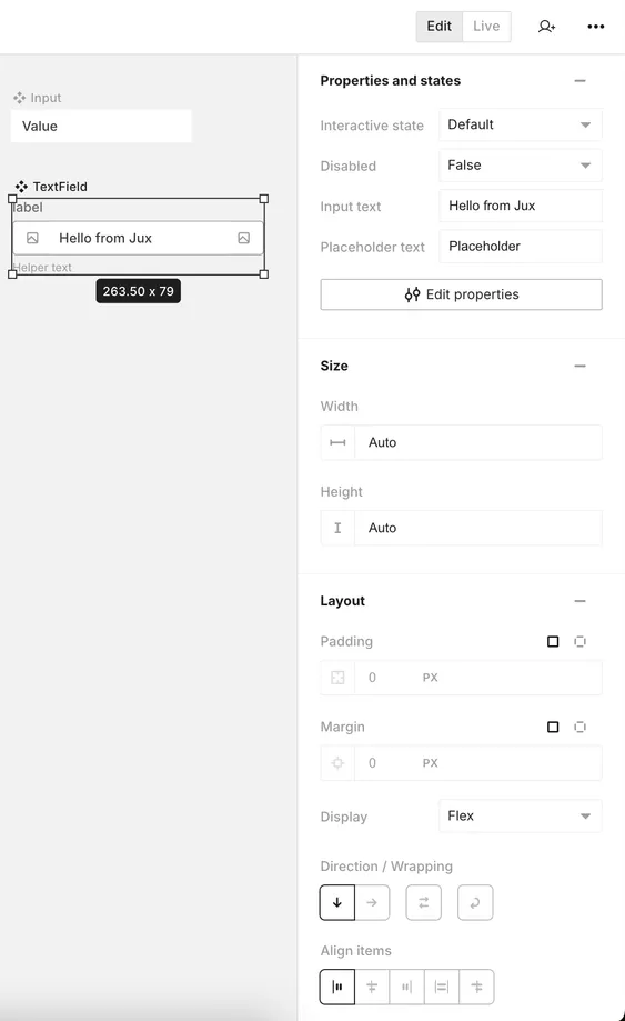
The Dynamic Design Panel (DDP) is a crucial interface element in Jux:
- Location: Right side of the screen
- Purpose: Primary input area for all visual properties of an object
- Functionality: Dynamically adapts to the type of object selected on the canvas or in the layers panel
The DDP serves as your control center for customizing the appearance and behavior of design elements, providing a responsive and context-sensitive interface for efficient design work.
Anatomy of the Dynamic Design Panel
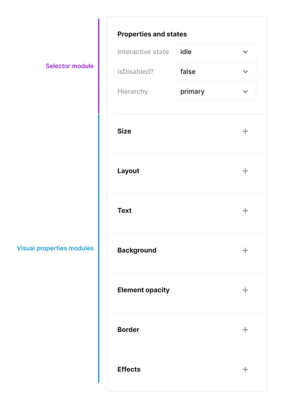
The Dynamic Design Panel comprises two main parts:
-
Selector Module:
- Contains all the properties a component or element possesses
- Determines which options are available in the visual modules
-
Visual Modules:
- Display all the visual choices available for the selected object
- Options in these modules are influenced by the state of the selector module
- Allow for detailed customization of the object’s appearance and behavior
This two-part structure ensures that you always have access to the most relevant design options for the currently selected element.
Hierarchical Organization
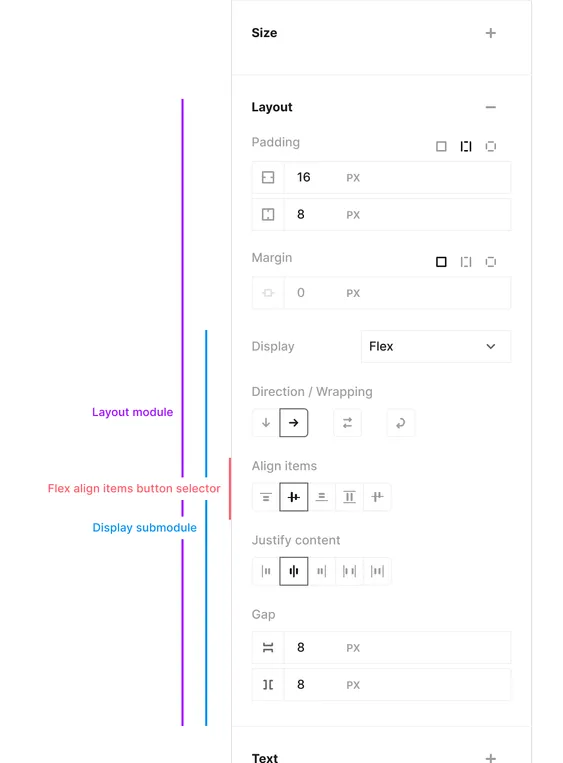
The Dynamic Design Panel follows a hierarchical structure to organize design options:
-
Modules
- Affect broad categories of visual choices (e.g., size, layout, typography, background, border, effects)
- Feature an expand/contract switcher for easy navigation
- Appear only when relevant to the selected object
-
Submodules
- More specific partitions within a module
- Group related fields targeting specific visual properties
- May include configuration buttons for additional options
-
Input Fields / Input Buttons
- The most granular level of visual control
- Examples include text color, top padding, flex direction, row gap, line height, etc.
- Most input fields can be tokenized for consistent design system implementation
This hierarchical structure allows for intuitive navigation and precise control over your design elements, from broad categories down to specific details.
Input Fields
The Dynamic Design Panel offers two main types of input fields:
-
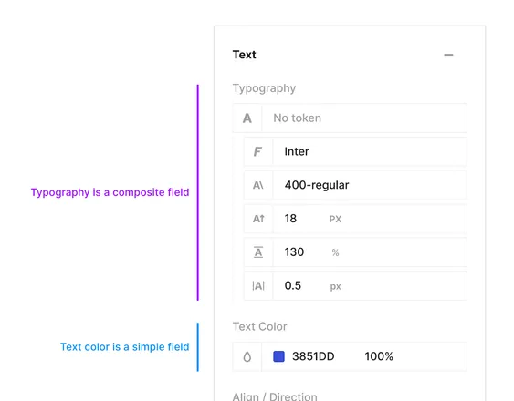
Simple Fields
- Control a single value
- Example: text color
-
Composite Fields
- Combine multiple simple value fields into a unified set
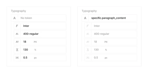
- Example: typography composite input (as shown in the image)
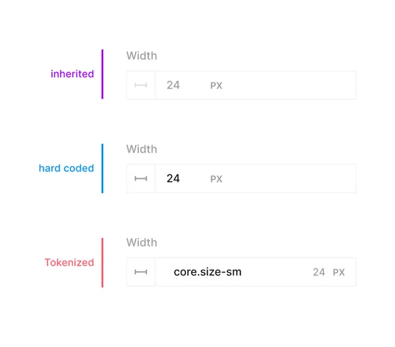
DDP field values can exist in one of three states:
Inherited
Value is either the browser default, inherited from a parent element, or ‘none’ (indicating no selection, e.g., no background color for a div)
Hard-coded
Value is inserted in its raw form (not tokenized) for the specific selection shown in the selector module
Tokenized
Value is represented by a token chosen from the token list, which refers to a raw final value
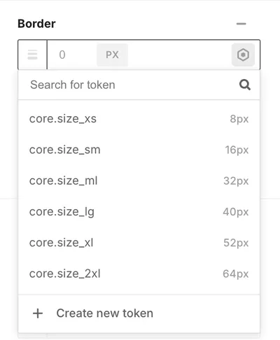
To tokenize a field, simply hover over the field, click the ‘token icon button’, and select from the expanded list of possible tokens for that field. To detach a token (revert to hard-coded value), click the ‘detach icon button’.
Simple Fields
Simple fields control a single value and are tokenized with specific tokens.
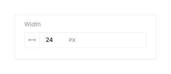
Dimension
- Accepts: Numerical value and unit selection
- Can be tokenized with dimension tokens
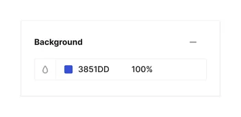
Color
- Accepts: Hex value for color and percentage for opacity
- Can be tokenized with color tokens
Composite Fields
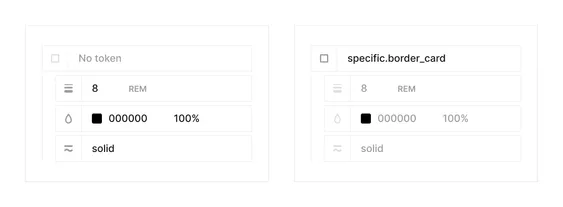
Composite fields have a hierarchical structure. When tokenized, all subsidiary values are pre-defined and appear in a disabled state.
Typography
Comprises:
- Font family
- Font weight
- Font size (dimension)
- Line height (dimension)
- Letter spacing (dimension)
Border
All 3 fields can be applied independently if needed
- Border width (dimension)
- Border color (color)
- Border style
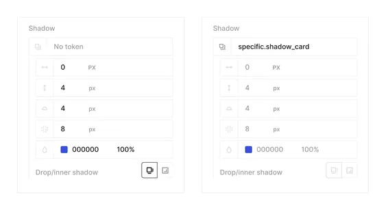
Shadow
Comprises:
- X-direction
- Y-direction
- Spread
- Blur
- Shadow color
- Drop/inner shadow selector
