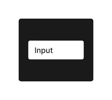
Input Element

Technical Definition
The <input> HTML element is used to create interactive controls for web-based forms in order to accept data from the user; a wide variety of types of input data and control widgets are available, depending on the device and user agent. This element in Jux only allows a simple text input type, other types are coming soon.
Anatony and Styling
In Jux - the input element is a single indivisible layer. No other elements can be placed inside of the input.
The way to style the both the text value and the text placeholder is directly on the input itself. To switch between the styling of the value to the styling of the placeholder - change the selection on the ‘input mode’ property in the DDP.

Props and States
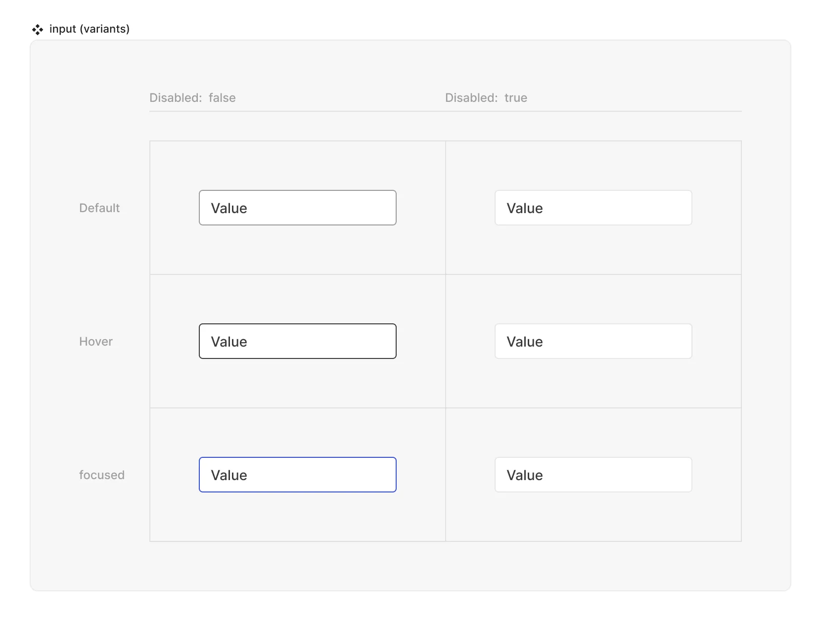
- Interactive state:
- Default
- Hover
- Active
- Disabled property
- true
- false
- Input mode (selects which content the rest of the DDP will affect:
- Value
- Placeholder
- Input text (text string)
- Placeholder text (text string)
Matrix

Special mechanics
The input has the limitation that no other element can be put inside of it, and if clicked anywhere in it’s area - will trigger the focus state to start typing.
Live mode
In live mode you can:
- Check the interactive states of the input
- See the placeholder that was set in the source / instance of the input
- Type any value inside the input and see the placeholder text disappear.