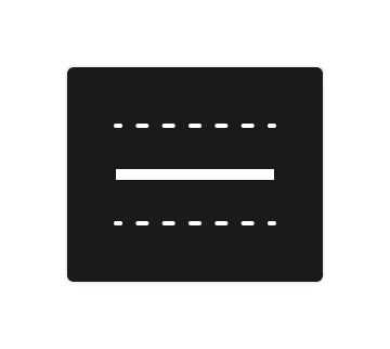
Divider

Technical definition
The divider is not a formal HTML element, but frequently used in websites and web and native apps. Dividers allow users to separate between groups of objects easily.
Anatomy and styling
In Jux - the divider element is very simply a div within a div.
You can influence the styling of the divider line in relation to the divider element’s state and properties by selecting them in the parent context module.
In case you want to add more children to the divider, you can hide some of the children in some of the states - using display: none
If you add assets to your divider, you can change their content by using the ‘asset content’ property
Props and states

- Interactive state:
- Default
- Hover
- Active
- Padding size
- No padding
- Small
- Medium
- Large
- Thickness
- Thin
- Medium
- Thick
