Layout
The layout module consists of the following submodules:
Padding Submodule
Padding is the internal spacing inside an element, surrounding the content and appearing before the border. Units can be set in PX, VW, VH, EM, or REM.
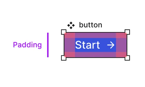
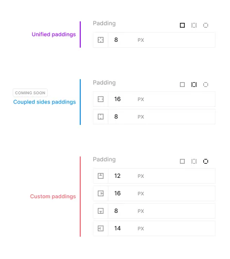
There are three control methods for padding:
- Unified (same padding on all sides)
- Pairs (top/bottom, left/right)
- Custom (individual control for each side)
Margin Submodule
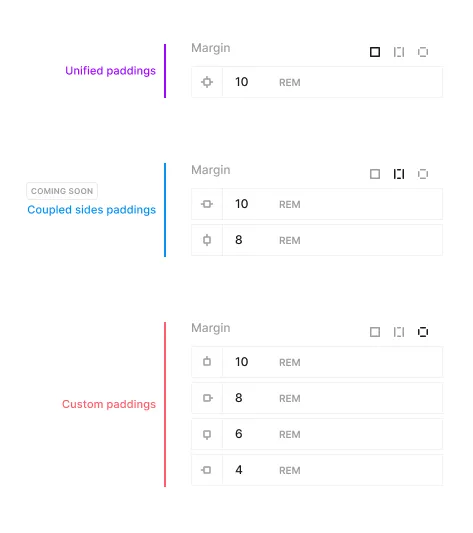
Margin is the external spacing outside an element, surrounding the border. Units can be set in PX, VW, VH, EM, or REM.
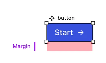
There are three control methods for margin:
- Unified (same margin on all sides)
- Pairs (top/bottom, left/right)
- Custom (individual control for each side)
Display Submodule
The display submodule controls the layout of an element.
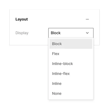
Options include:
Block
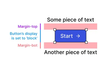
The element will take up the full width of the parent container and stack vertically.
Flex
The element will become a flex container, allowing you to control the layout of its children.
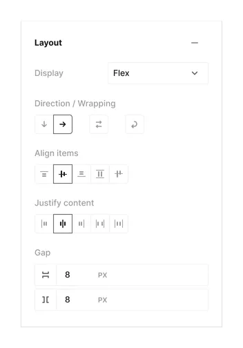
Flex properties include:
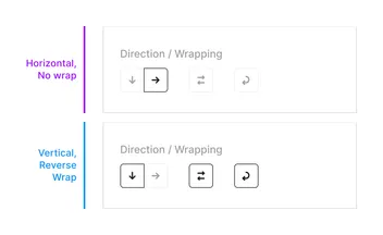
Direction
Sets how flex items are placed in the flex container, and the direction (normal / reversed).
Wrapping
Sets whether flex items are forced onto one line or can wrap onto multiple lines. If wrapping is allowed, it sets the direction that lines are stacked.
Align Items
Sets the alignment of items along the cross axis, depending on the flex direction.
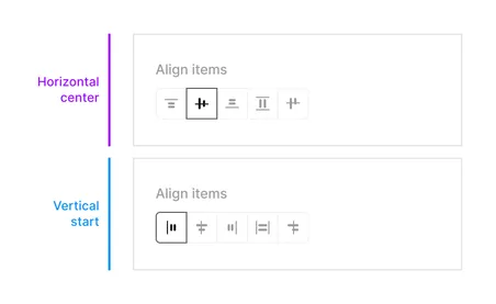
Align items can be set to 5 different options:
-
Start - Aligns items to the start of the container.
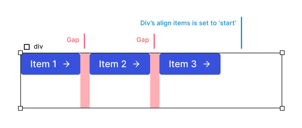
Align Start -
Center - Aligns items to the center of the container.
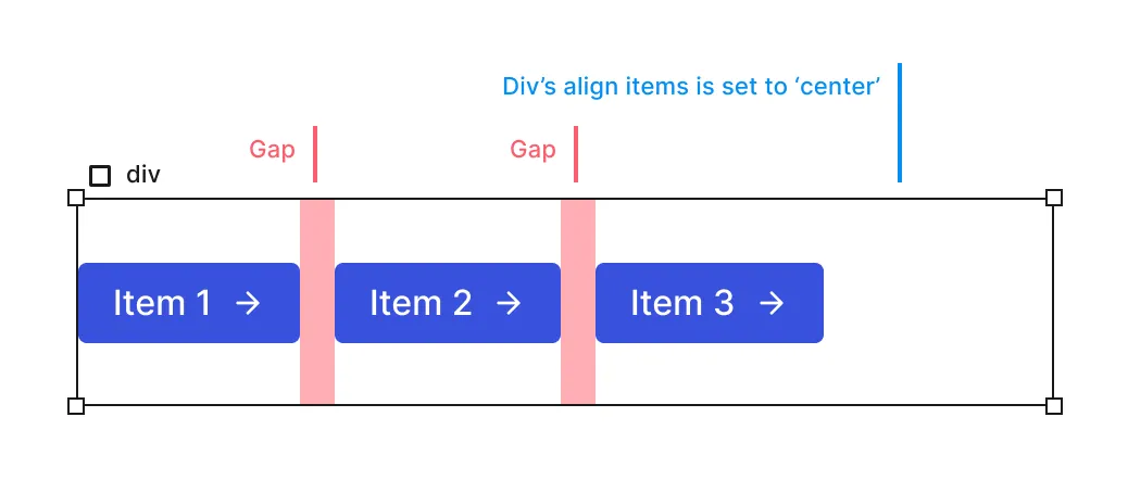
Align Center -
End - Aligns items to the end of the container.
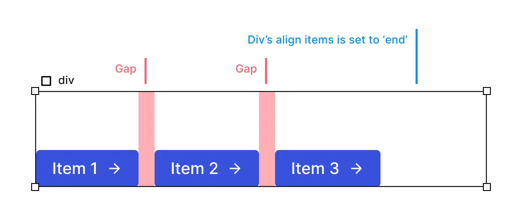
Align End -
Stretch - Stretches items to fill the container.
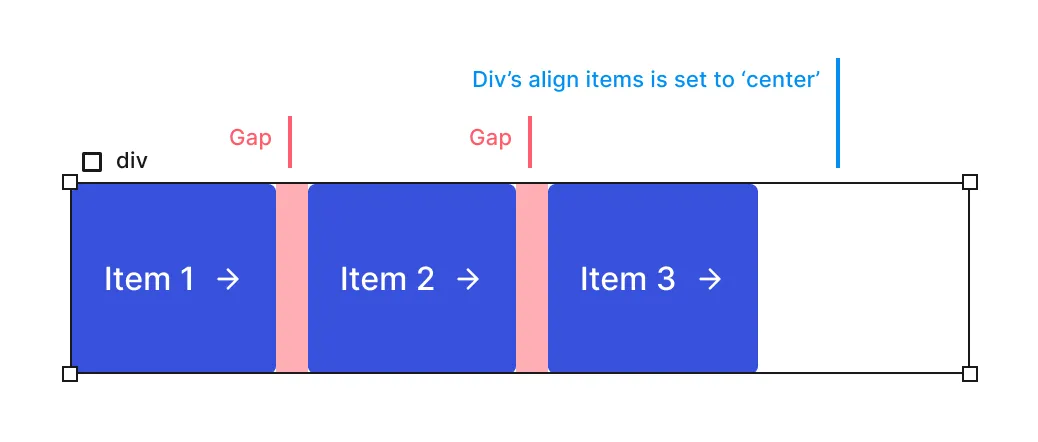
Align Stretch -
Baseline - Aligns items to the baseline of the container.
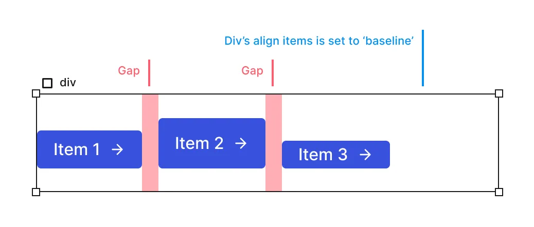
Align Baseline
Justify Content
Sets the alignment of items along the main axis, depending on the flex direction.
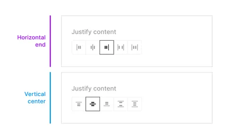
Justify content can be set to 5 different options:
-
Start - Aligns items to the start of the container in the main axis.

Justify Start -
Center - Aligns items to the center of the container in the main axis.

Justify Center -
End - Aligns items to the end of the container in the main axis

Justify End -
Space between - Distributes items evenly, with the first item at the start and the last item at the end.

Justify Between -
Space around - Distributes items evenly, with equal space around them.

Justify Around
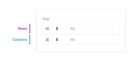
Gap
Sets the space between flex items.
Inline Flex
The element will become an inline flex container, allowing you to control the layout of its children. Inline flex has the same properties as flex.
Inline
The element generates an inline box that does not create line breaks before or after itself. In normal flow, if there is available space, the next element will appear on the same line.

None
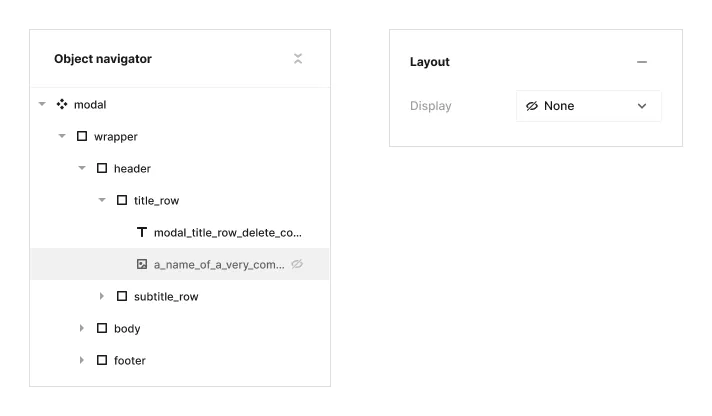
Turning off the display of an object removes its effect on layout (the document renders as if the object doesn’t exist). This setting also hides all descendant objects.
When an object is hidden:
- It cannot be accessed from the canvas
- It can only be accessed via the layers panel
- The layers panel will show a special ‘eye’ indicator for hidden objects
This feature allows for temporary removal of elements from the design without deleting them.
