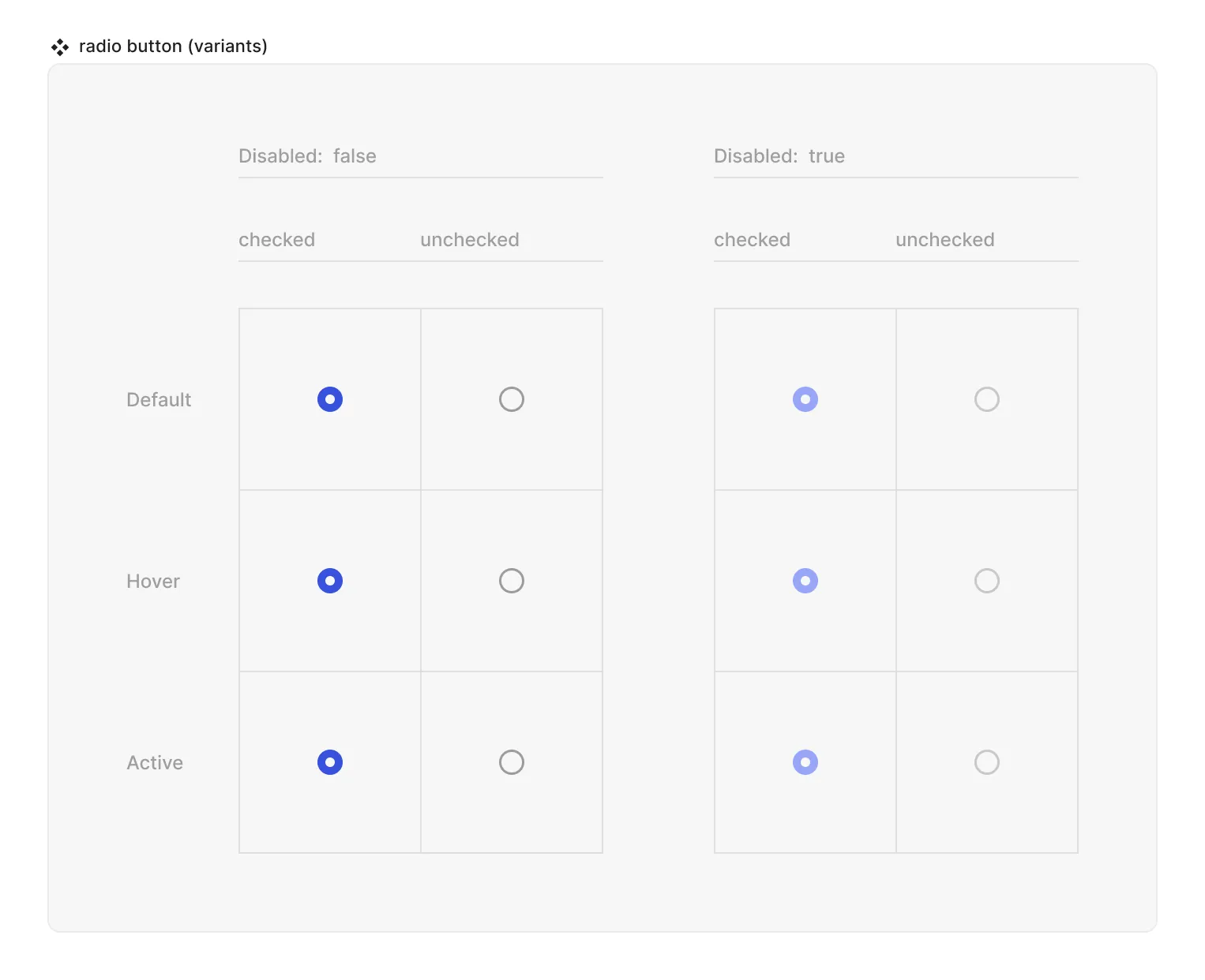
Radio Field

Technical definition
<input> elements of type radio are generally used in radio groups—collections of radio buttons describing a set of related options.
Only one radio button in a given group can be selected at the same time. Radio buttons are typically rendered as small circles, which are filled or highlighted when selected.
Anatomy and styling
The Radio button element consists of 2 logical slots. A slot that “holds” the ‘circle radio’ in it for the “states”: checked/uncheck, and another slot that “holds” a text wrapper div with a label and a helper text. You can influence the styling of the children of the radio in relation to the radio’s state and properties by selecting them in the parent context module. If you want a special asset to represent the radio, you can later change this SVG assets by using the ‘asset content’ property

Props and states
- Interactive state:
- Default
- Hover
- Active
- Disabled property
- true
- false
- Checked state (special):
- checked
- unchecked
- Value property (field) [coming soon]

Special mechanics
The checked property cannot be deleted or edited.
Live mode
In live mode you can:
- Check the interactive states of the radio.
- Change the state of the radio from unchecked to checked (but not reverse it) by clicking either on the primitive or the whatever is in the trigger logical slot. Note that in reality radio buttons never come in singular form, but rather in radio groups, so your actual use inside screens and form components will be through the ‘radio group’ element.