Checkbox Field

Technical definition
<input> elements of type checkbox are rendered by default as boxes that are checked (ticked) when activated. A checkbox allows you to select single values for submission in a form (or not).
Anatomy and styling
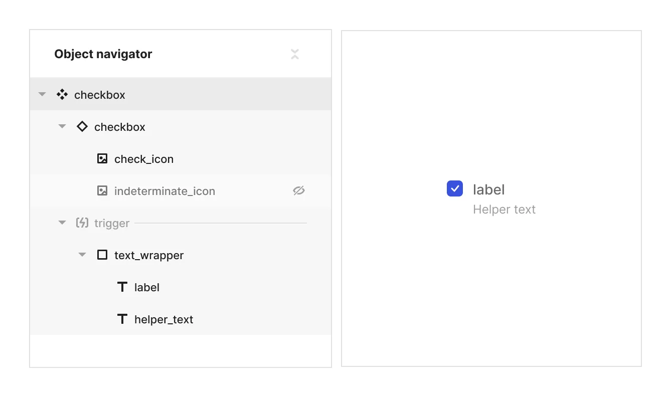
The checkbox element consists of 2 main parts. An instance of the checkbox element and a logical slot named ‘trigger’, that holds a text wrapper div with a label and a helper text.

Props and states
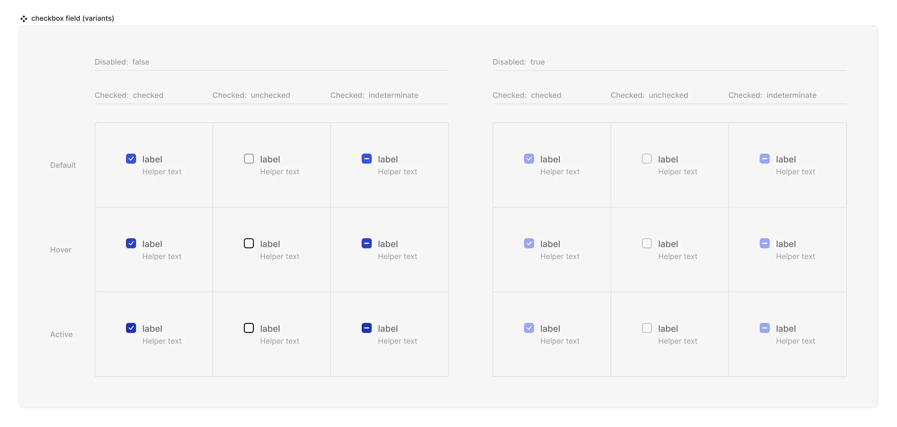
- Interactive state:
- Default
- Hover
- Active
- Disabled property
- true
- false
- Checked state (special, linked to the instance of ‘checkbox’):
- checked
- unchecked
- indeterminate
Matrix

Special mechanics
- Checkbox instance and the Checkbox field are mirrored in the disabled and checked properties. This means that the state of the property checked (values can be checked, unchecked or indeterminate) is always the same both in the instance of the checkbox and the checkbox field component.
- Trigger (hit area) - is a container that can control the interactive state and checked state of the checkbox instance. It can be empty or it can have other objects in it. For example if the label and a helper text are inside the trigger - hovering them will cause the checkbox instance to be in it’s hover state and clicking on either of them will alter the checked state of the checkbox instance. Use this ability to have fine grained control over which elements do affect the checkbox and which don’t.
Live mode
In live mode you can:
- Check the interactive states of the checkbox.
- Change the state of the checkbox by clicking either on the checkbox instance or on whatever is in the ‘trigger’ logical slot. Note that in a single checkbox the indeterminate state cannot be caused by checking or unchecking the checkbox, it’s only relevant where nested checkbox groups are involved or if indeterminate is the default state of the checkbox in a field (not possible in Jux but is possible by the dev in code.