Chip

Technical definition
Chip is not a formal HTML element, but frequently used in websites and web and native apps. Chips allow users to make selections, filter content, or trigger actions.
Anatomy and styling
In Jux - the chip element comes pre-loaded with a text label. You can place any other element inside the chip with no limitation. All the area of the chip, when clicked will change the state between ‘selected’ and ‘not selected’.
You can influence the styling of the children of the chip in relation to the chip’s state and properties by selecting them in the parent context module.
To hide some of the children in some of the states - use display: none
If you use assets in the chip, you can change their content by using the ‘asset content’ property
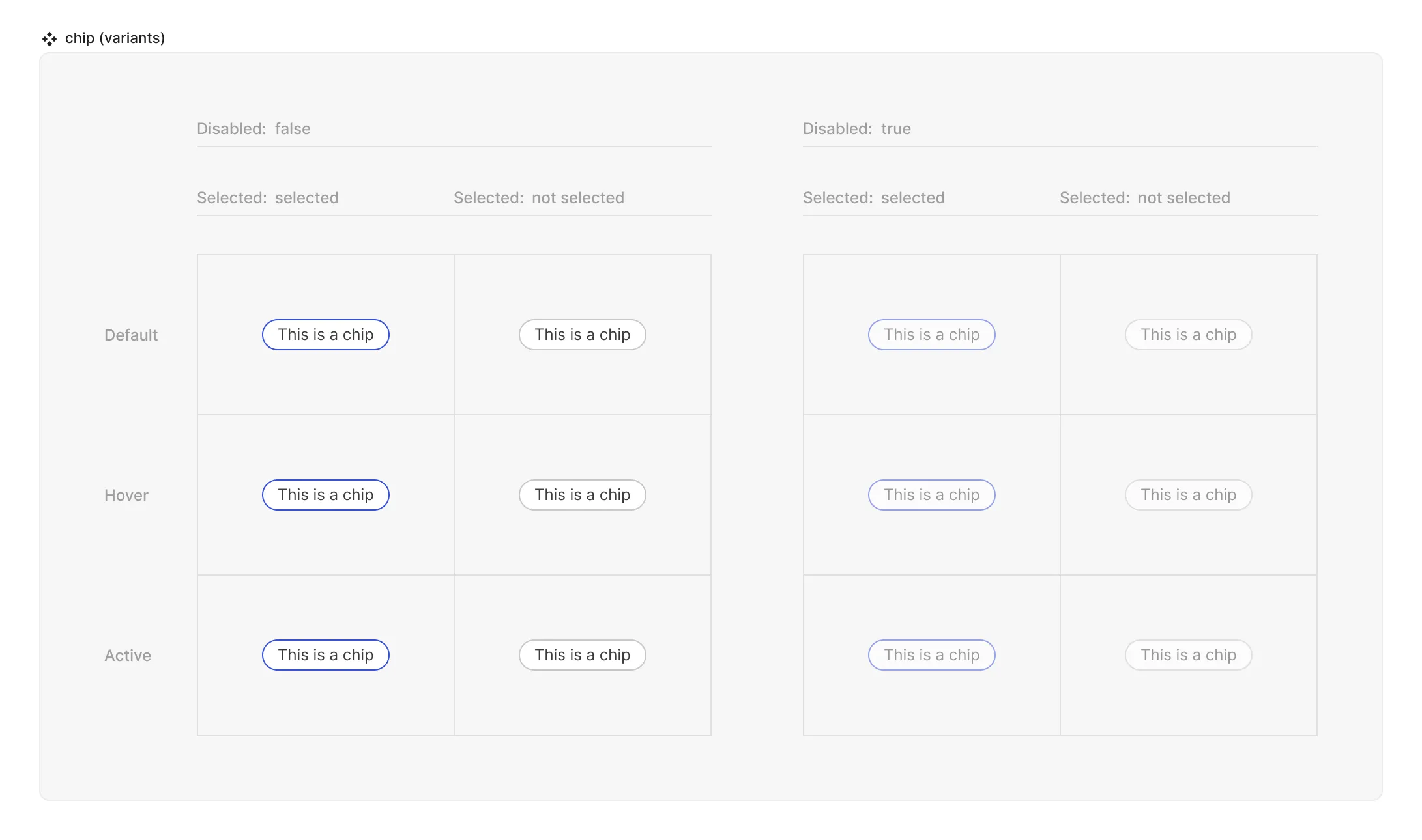
Props and states

- Interactive state:
- Default
- Hover
- Active
- Disabled property
- true
- false
- Selected (special):
- selected
- not selected

Special mechanics
The chip does not have any special mechanics but for the fact that all the area of the chip - if clicked - will switch between the ‘selected’ and ‘not selected’ values.