Radio Field

Technical definition
<input> elements of type radio are generally used in radio groups—collections of radio buttons describing a set of related options.
Only one radio button in a given group can be selected at the same time. Radio buttons are typically rendered as small circles, which are filled or highlighted when selected.
Anatomy and styling
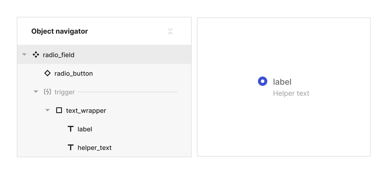
The Radio field element consists of 2 parts: An instance of the radio button element and a logical slot named ‘trigger’, that holds a text wrapper div with a label and a helper text.

Props and states
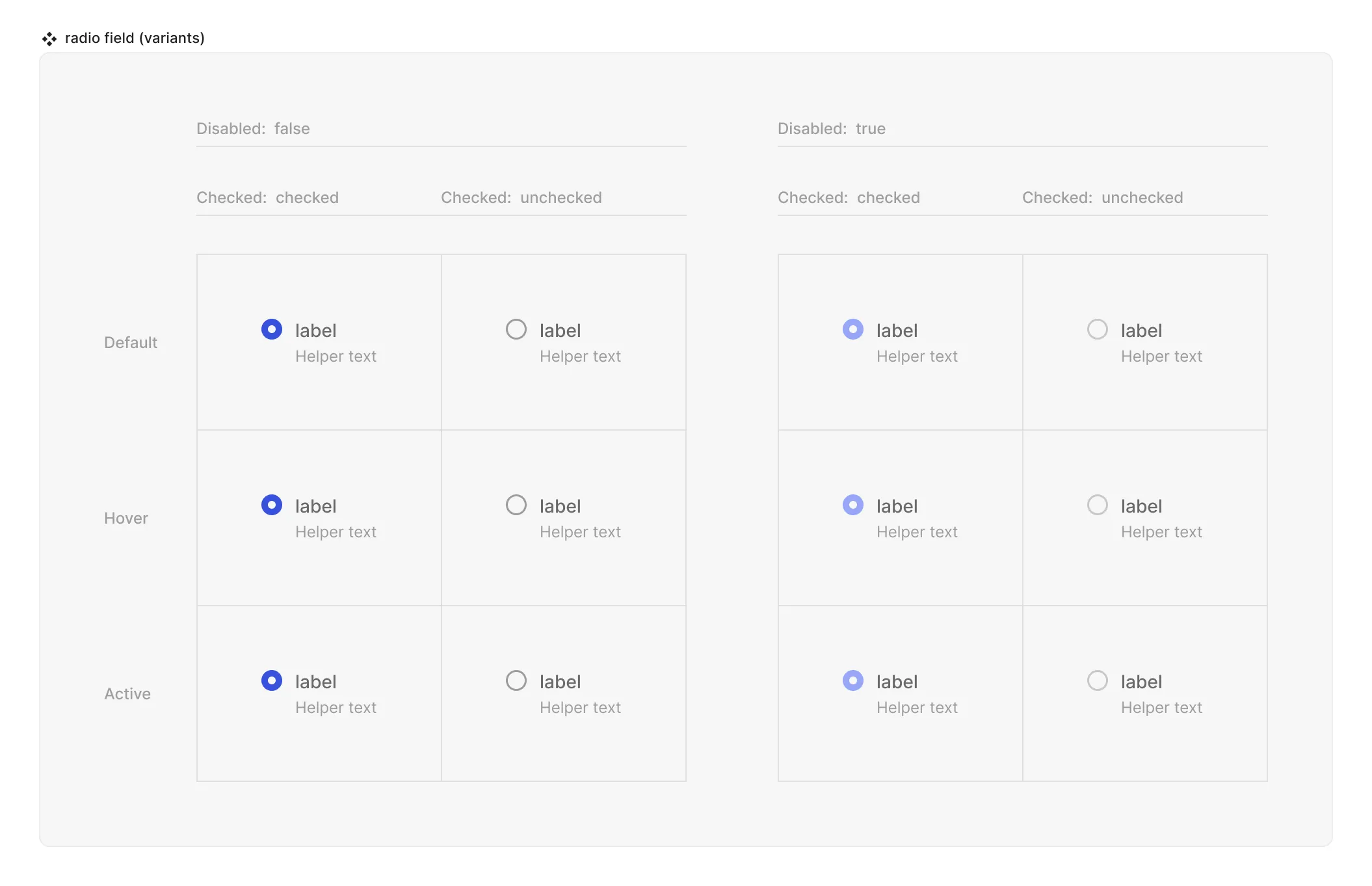
- Interactive state:
- Default
- Hover
- Active
- Disabled property
- true
- false
- Checked state (special, linked to the instance of ‘radio button’):
- checked
- unchecked
- Value property (field) [coming soon]

Special mechanics
- Radio button instance and the Radio field are mirrored in the disabled and checked properties. This means that the state of the property checked (values can be checked or unchecked) is always the same both in the instance of the Radio button and the Radio field component.
- Trigger (hit area) - is a container that can control the interactive state and checked state of the Radio button instance. It can be empty or it can have other objects in it. For example if the label and a helper text are inside the trigger - hovering them will cause the Radio button instance to be in it’s hover state and clicking on either of them will alter the checked state of the Radio button instance. Use this ability to have fine grained control over which elements do affect the Radio button and which don’t.
Live mode
In live mode you can:
- Check the interactive states of the radio button.
- Change the state of the radio from unchecked to checked (but not reverse it) by clicking either on the primitive or the whatever is in the trigger logical slot. Note that in reality radio buttons never come in singular form, but rather in radio groups, so your actual use inside screens and form components will be through the ‘radio group’ element.