Tokens Management
What are Tokens?
Design tokens are reusable visual elements that represent design choices in user interface design. Tokens provide a unified language for communicating design decisions, allowing for a multi-layered architecture of styles which are then used in code.
Design tokens are defined and stored in a central location (in Jux - the token management page), allowing designers to quickly and easily apply consistent styles across various products and projects. Tokens include styling information such as colors, typography, dimensions (for size, space etc) etc. This allows for a more efficient and scalable design process, as designers can reuse and build upon existing tokens instead of starting from scratch each time.
With the use of the JSON format, design tokens allow developers to implement design decisions across code bases, while being agnostic to the framework. Using design tokens in this manner allows teams to collaborate more easily, align their designs with brand design guidelines, and increase efficiency.
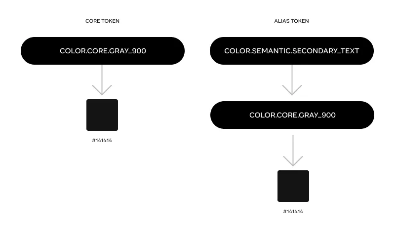
It’s important to keep in mind that there are two properties that tokens can have, with two options for each property: alias vs non-alias tokens:
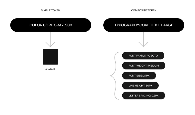
and simple vs composite tokens:
For more references check out this article for a deeper dive. Also, Tokens naming is an important topic recommended to read about here.
Jux token management
Jux tokens are managed in a dedicated page, accessed through the left sidebar navigation panel.
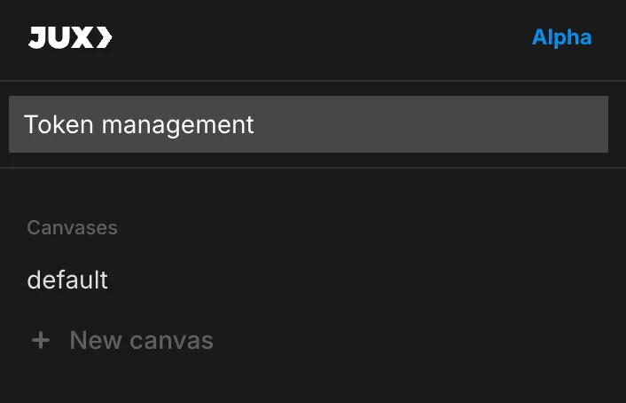
It is organized by types based on W3C standards. Currently 4 types - Color, Typography, Font family and Dimension:
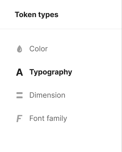
You can create different token sets: a core set for core tokens and theme sets with alias tokens that are identical in structure, but point to different core tokens in the core set. (for example light/dark dense/loose modes of the UI).
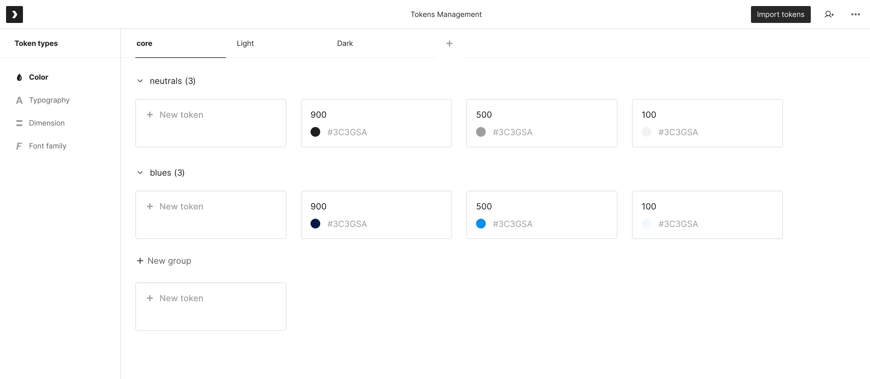
The way to structure tokens in Jux:
- Start by creating the core tokens in the core set (ex. brand colors)
- Create theme sets which will have alias tokens that will point to some of the core tokens in the core set.
- You can use any taxonomy you’d like for the token structure, with the only rigid parts being that they would start with the token type (color for example) and then follow the folder structure (color.folder.folder.folder.token_name). Tokens in the core set will also have ‘core’ as the second item in the token name (color.core.folder.folder.folder.token_name).
- You can duplicate the theme sets to have as many as you need.
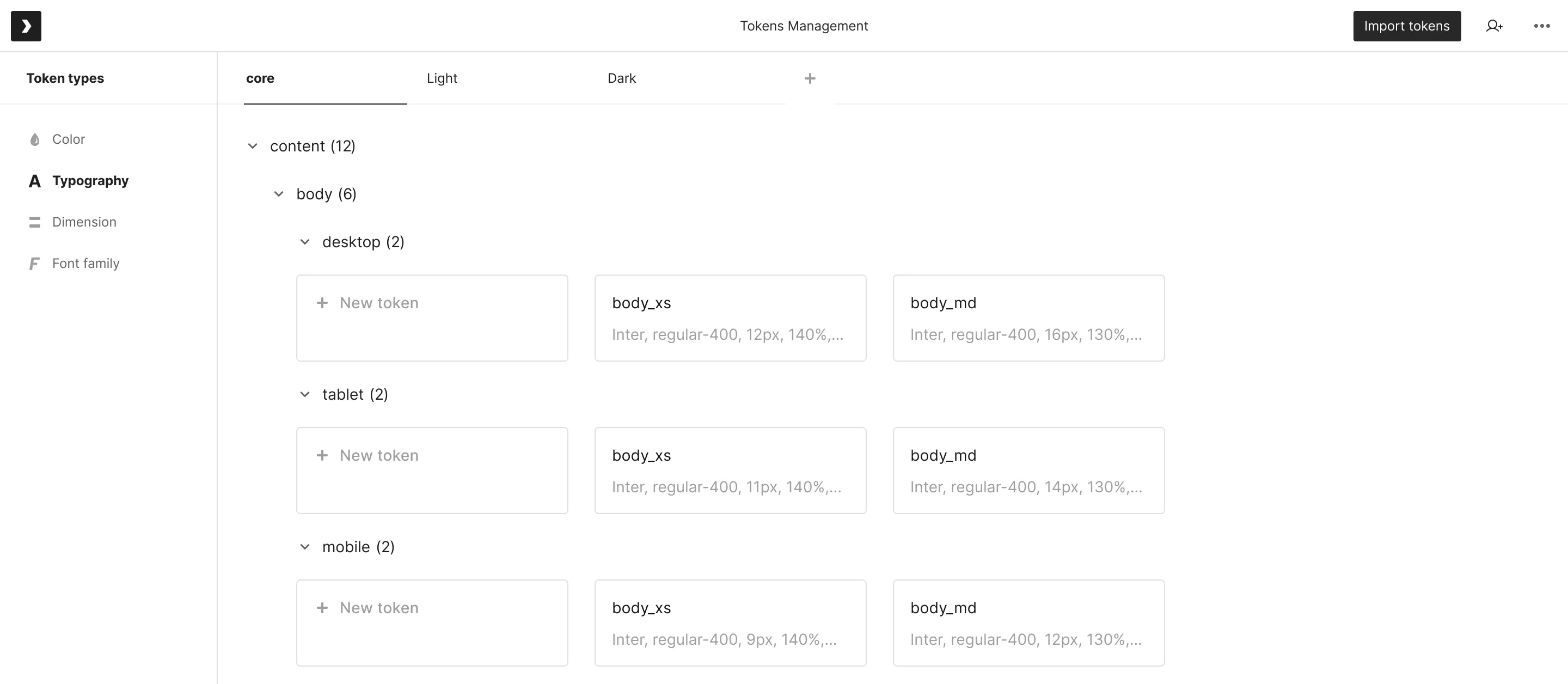
Using tokens in Jux
Tokens can be created and edited in the management page. Once created, they will appear in the Editor DDP (dynamic design panel) inputs for selection.
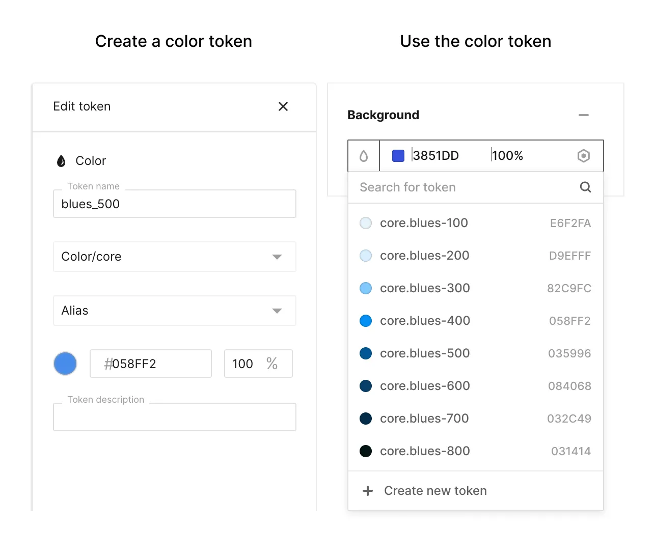
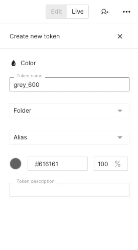
Sometimes, it’s more convenient to create a new token while testing the design decisions (values) on different components, on the canvas itself. To create tokens in the editor view on canvas, hover over the DDP fields to reveal the token icon menu button and click it. Create token action is placed at the bottom of the dropdown. After clicking it - the ‘token creation sidebar’ will appear for you to make sure the values are correct and save it.
Sharing design tokens with development
All the tokens you see in the token management page are immediately shared with the developers once they use the Jux CLI ‘pull’ command. If any new token is created - it will be shared the next time the developers use the pull command. If any token is updated in the Jux token management screen - the corresponding token will be updated after the next ‘pull’.