Matrix
Source component variants matrix
A component variant is a representation of a UI component, a unique combination of values for each property that a component has (e.g., size, hierarchy or shape), while sharing the same core structure and functionality. Product designers often manually arrange component variants and their states into a matrix so they can be styled efficiently. But what if this time-consuming process could be automated? With Jux, an automatic variants matrix is generated for any selected component! Simply click the Open Matrix button (Shift+M) in the top navigation bar. Using a combination of properties and states, Jux generates the matrix for you.
Initial out of the box matrix
Every component—whether local or from the library—has its own variants and states matrix:
- Prebuilt properties and states - Jux elements come with prebuilt properties and states to simplify your workflow. These include essential properties required for the component to function and frequently used ones. Once an element is placed on the canvas, it becomes a local component. Opening its matrix reveals all default properties and states, arranged automatically.
- Components without properties - If a component is created from a wrapping
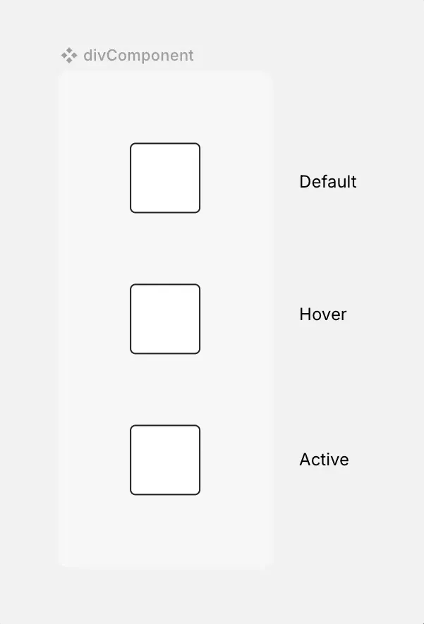
div(with no properties), the matrix will initially display only the default states that apply to all components. (The ability to toggle these states off is part of our roadmap.)

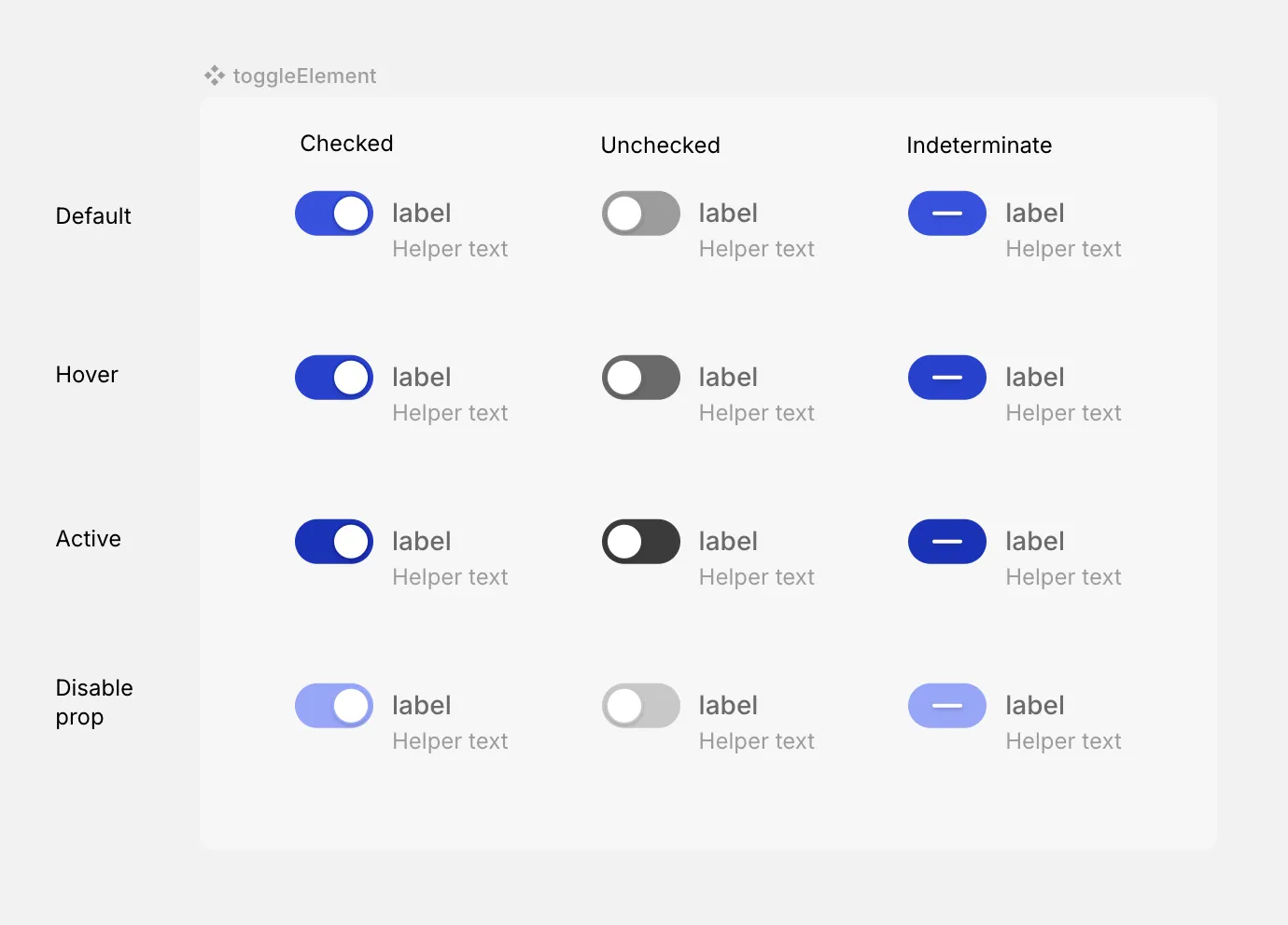
Toggle element with prebuilt properties and states

Component created out of a div with states and properties (yet!)
Matrix structure and behaviors
The matrix is designed with specific rules and behaviors to ensure consistency and ease of use. It is organized in an increasing modular manner, the first property will have it’s values stand as adjacent columns, the second property will have show grouped columns by each value, and so on, increasing with every property you add.
-
Variants creation and editing - Property creation, deletion, and editing are only possible in the DDP’s “Properties & States” module. The matrix will reflect changes made in real time.
-
States and disable property - States are displayed on the vertical axis (Y). The top-left cell represents the default state, followed by hover and active states. Below these, the
disabled: trueproperty is displayed, integrated with the states. Since the disable property doesn’t interact with states like other properties, it’s placed below them in order to avoid duplicating the matrix.
Toggle element matrix - Y axis dispalying the states and disable prop
-
Uniform structure across variants - All objects (children) of all variants are the same, this means that each variant of a source component has the same layer structure. Text and assets must remain the same across all variants, with differences limited to styling. Editing these elements updates them across all variants automatically. If you want instances to contain dynamic content, insert a Dynamic Content Slot in the matrix.
-
Default as the root component - Styling changes made to the default state of each value (in the matrix, of each column) cascade to all other states unless overridden by a more specific change. For example, if you set the default text size to 16px, hover and active states inherit it. However, if you explicitly set the hover text size to 20px, subsequent changes to the default will no longer affect the hover state.
-
Please note that the
disabled: truerow will not inherit the styling of the default variant since it is not really a state but a distinct property. -
Variant layers naming - Layer names reflect the specific property values of each variant. These names are fixed (not editable) to maintain clarity and consistency for developers.

-
Variants themselves cannot be dragged, but you can drag layers within a variant.
Layers can be moved:
- Within the same variant.
- Outside the matrix entirely.
- Adding layers - Once you drag something into one variant - all of the variants will have the object as well.
Matrix preferences
The matrix itself can be customized in the DDP by adjusting the padding and background color. It will only affect the specific matrix selected and not other matrices on the canvas.
Live view
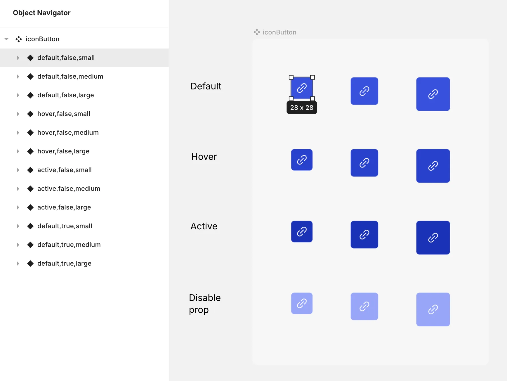
When switching to live mode, the matrix reorganizes for a clearer presentation. States fold into their respective variants. Disabled variants appear below their corresponding states for better visibility.

A live view of the button matrix
On our road map
- In cases where they are not needed, toggle interactive states on and off.
- Automatic grid lines, props and values labels for explainability.
- Reordering properties and values of each prop.
- Multi select for easier styling.