Checkbox

Technical Definition
<input> elements of type checkbox are rendered by default as boxes that are checked (ticked) when activated. A checkbox allows you to select single values for submission in a form (or not).
Anatomy and styling
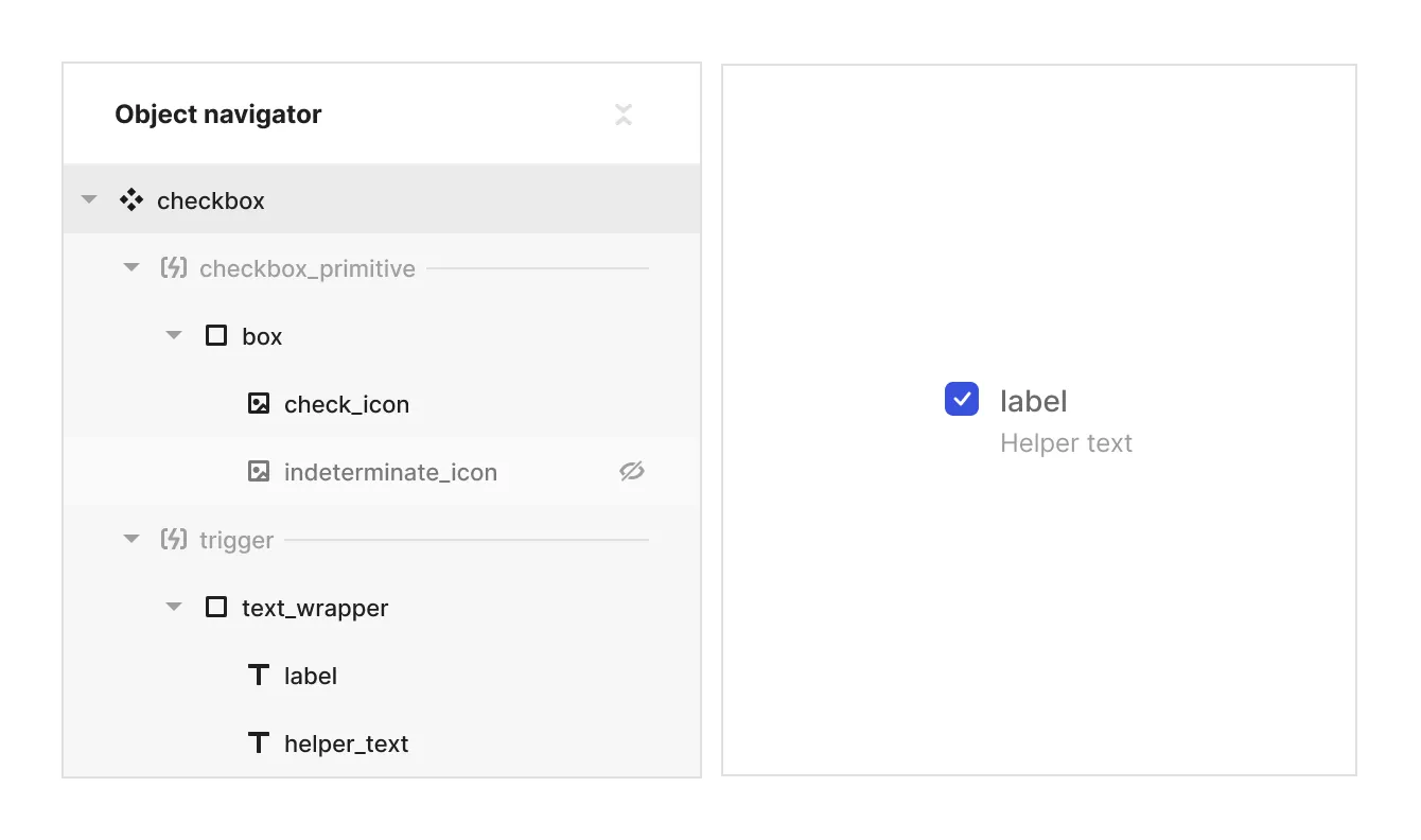
The checkbox element consists has 2 child assets: an icon for the ‘checked’ state, and an icon for ‘indeterminate’ state.
You can influence the styling of the children of the checkbox in relation to the checkbox’s state and properties by selecting them in the parent context module.
To hide some of the children in some of the states (like the indeterminate icon asset when the state is ‘checked’ or ‘unchecked’) - use display: none
To change the SVG assets of the check and indeterminate icons, use the ‘asset content’ property

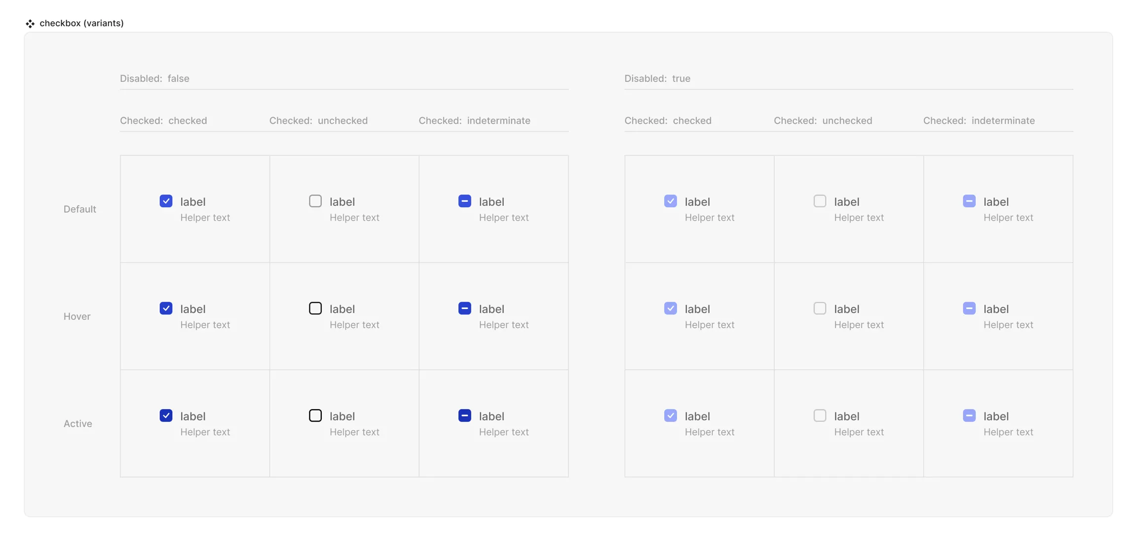
Props and States
- Interactive state:
- Default
- Hover
- Active
- Disabled property
- true
- false
- Checked state (special):
- checked
- unchecked
- indeterminate
Matrix

Live mode
In live mode you can:
- Check the interactive states of the checkbox.
- Change the state of the checkbox by clicking on it