Color Tokens
Color tokens in the Jux Editor
Jux supports color tokens as a combination of HEX value (like #141414) and opacity value as percentage (1-100). Despite having 2 distinct values the color token is still considered a simple -not a composite - token (like typography, shadow or border), since it can be written as a unified RGBA value.
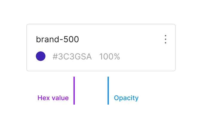
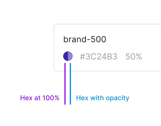
The color circular thumbnail will show both the hex value, and the unified opacity result if the opacity value is other than 100%
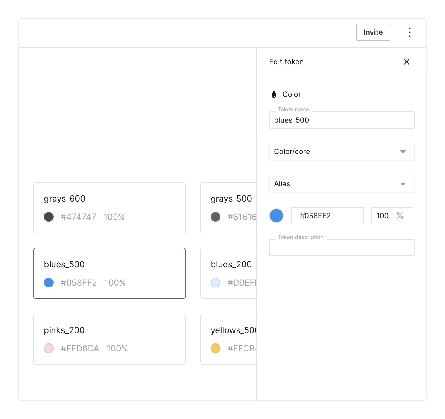
Color tokens have these fields:
- A name (like
blue-500orprimary-bg) - A folder path (like
color/core/blue-500) - Optional - an alias to another token
- Hex value
- Opacity value
- Optional - description
Color tokens can later be used in the DDP in the following modules:
- Background color
- Text color
- Border color
- Shadow color
- Asset color
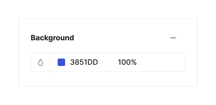
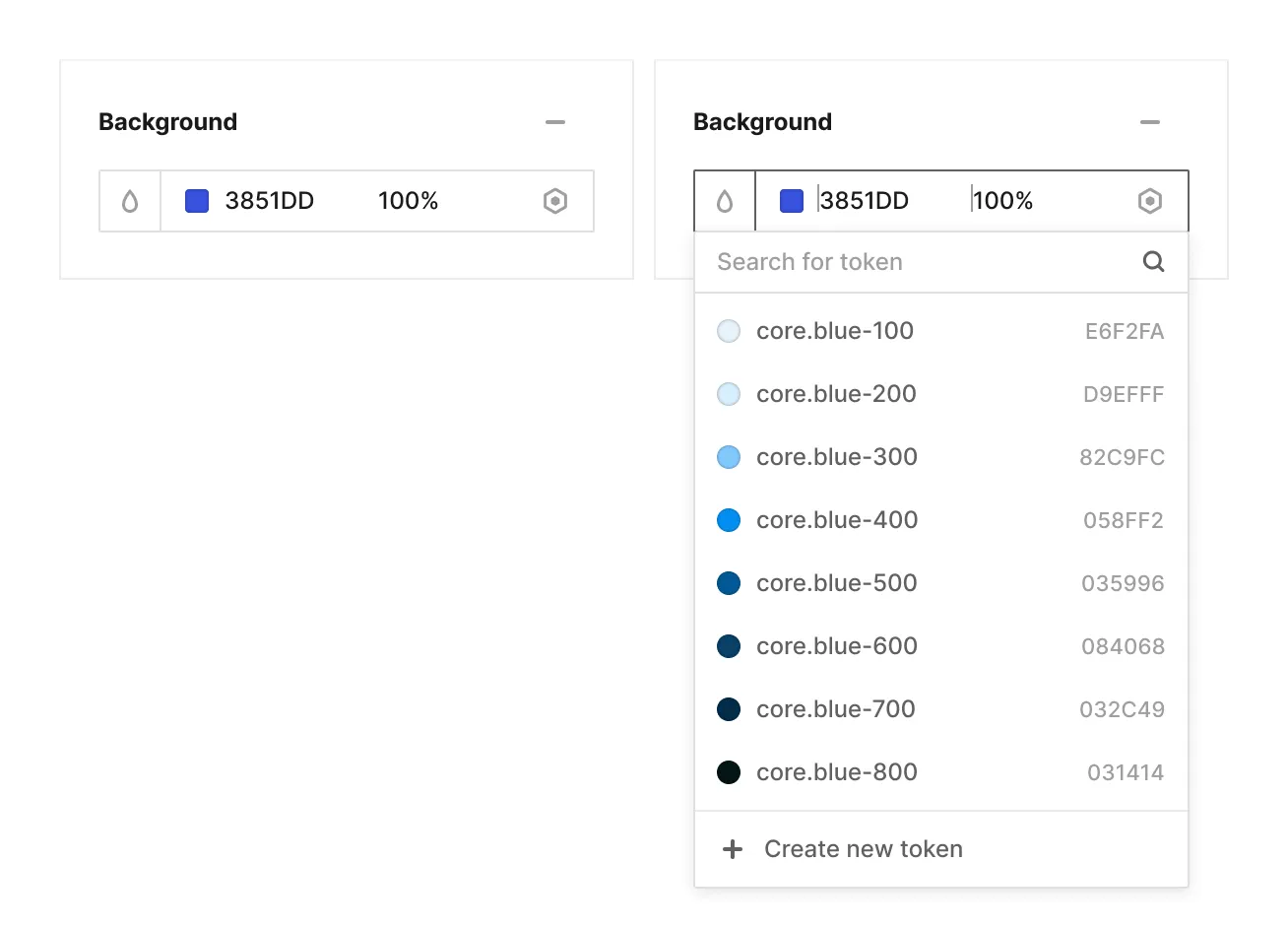
Each color field can be tokenized by clicking on the ‘token icon button’ that appears on the right side of the field upon hover:
Under the hood
JUX adheres to the W3C Community group’s draft guidelines regarding color tokens (section 8.1.) and stores the token as a JSON file with the following structure:
{ // Our opinianated structure uses type-based groups at the root level "color": { // We like to use core/semantic/specific as the base groups in all token // types, but this group's name can be any valid JSON identifier "core": { // Token names must be valid JSON identifiers, e.g. "Foo", "foo_0", "600" "600": { // Specifying the type here might seem redundant since the type is used // as the root-level grouping, but this is part of the W3C group's specs "$type": "color", "$value": "#ff00ff" "$description": "This is a color token in the core to use in brand" } } }}| Property | Type | Description |
|---|---|---|
$type | string | Required. "color" |
$value | string | Required. |
$description | string | (Optional) A description of this token and its intended usage. |