Toggle Element

Technical Definition
The toggle element in Jux represents an interactive control that allows users to switch between two states. It’s typically used in settings, preferences, and other UI components where binary options are available.
Anatony and Styling
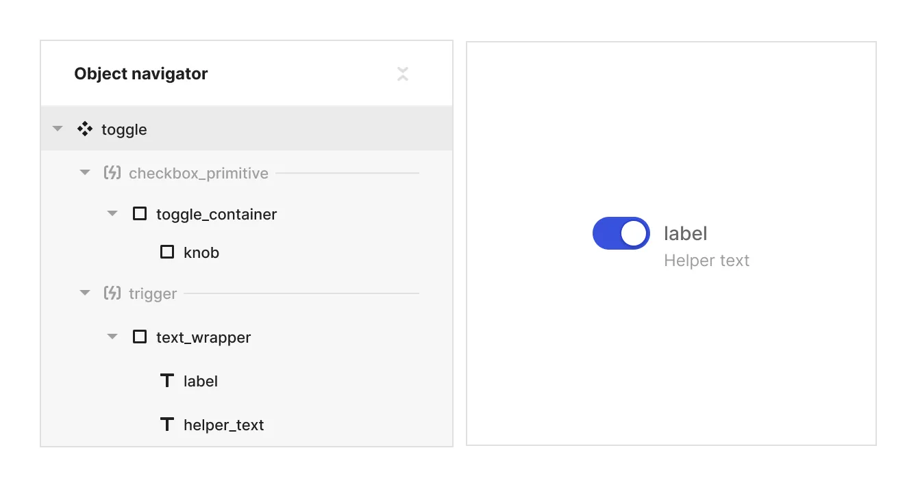
The checkbox element consists of two main parts:
- A box with assets for ‘checked’, ‘unchecked’, and ‘indeterminate’ states
- A text wrapper containing a label and helper text (which can be removed if not needed)
You can:
- Style each part independently based on the checkbox’s state and properties using the parent context module
- Hide specific elements in certain states
- Modify SVG assets for check and indeterminate icons via the ‘asset content’ property

Props and States
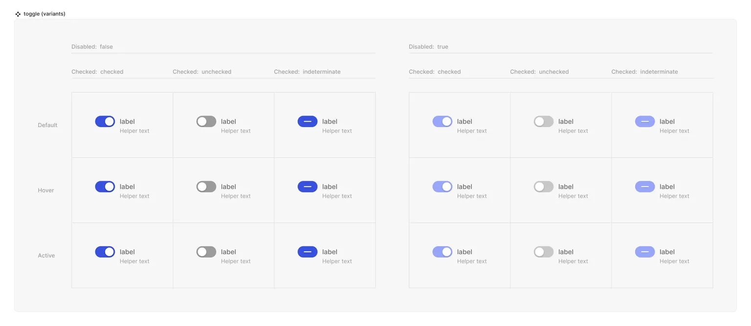
Toggle properties include:
-
Interactive state:
- Default
- Hover
- Active
-
Checked state (special):
- checked
- unchecked
- indeterminate
Toggle properties can be extended based on your design needs, allowing for custom properties to enhance functionality and design variations. However, core properties like ‘disabled’ can’t be removed to ensure proper web behavior.
Matrix

Special Mechanics
The toggle includes two logical slots:
- Toggle primitive: Contains the visual ‘toggle’ of the element. This slot must not be empty for proper functionality.
- Trigger (hit area): Allows objects inside to change the toggle state. Can be empty or contain other objects.
Live Mode
In live mode, you can:
- Test and visualize all interactive states of the toggle
- Change the toggle state by clicking on the primitive or anything in the trigger logical slot
While Jux provides a foundational toggle element, you have the flexibility to style and customize its appearance to match your specific design requirements.