Text Area

Technical definition
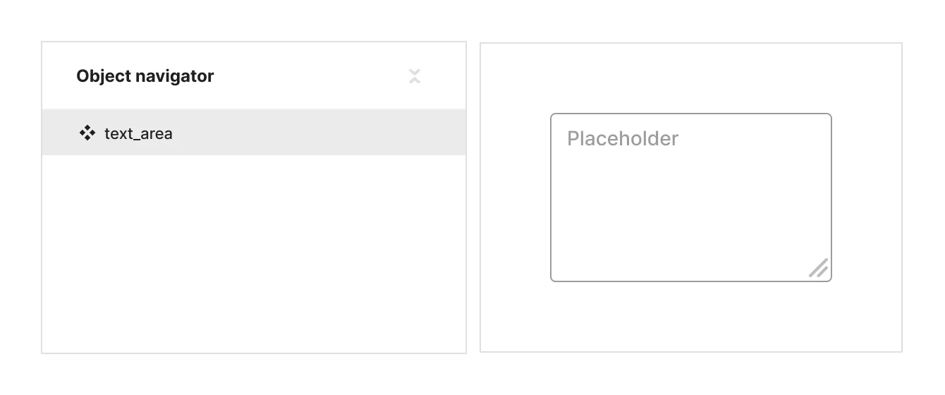
The <textarea> HTML element represents a multi-line plain-text editing control, useful when you want to allow users to enter a large amount of free-form text, for example a comment on a review or feedback form.
Anatomy and styling
The text area element is a single indivisible layer. No other elements can be placed inside of the text area.
The way to style both the text value and the text placeholder is directly on the input itself. To switch between the styling of the value to the styling of the placeholder - change the selection on the ‘input mode’ property in the DDP.

Props and states
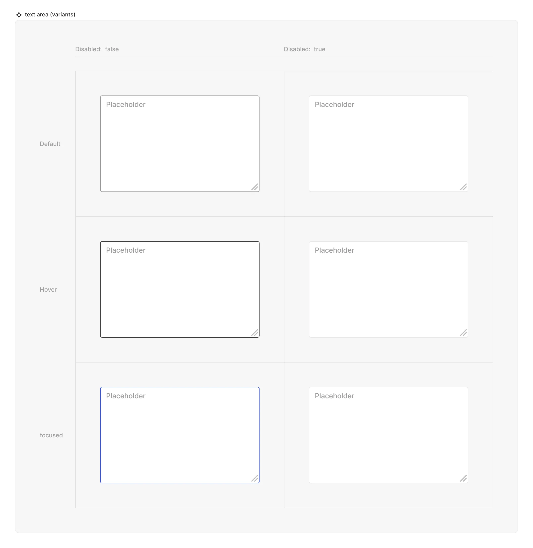
- Interactive state:
- Default
- Hover
- Active
- Disabled property
- true
- false
- Expandable (controls wether the text area can be resized when live)
- true
- false
- Input mode (selects which content the rest of the DDP will affect:
- Value
- Placeholder
- Input text (text string)
- Placeholder text (text string)
Matrix

Special mechanics
- The Text area has the limitation that no other element can be put inside of it, and if clicked anywhere in it’s area - will trigger the focus state to start typing.
- Expandable prop allows you to select wether the text area should be open to be resized when live.
Live mode
In live mode you can:
- Switch between the interactive states of the input
- See the placeholder that was set in the source / instance of the Text area
- Type any value inside the input and see the placeholder text disappear.
- If Expandable is true - resize the text area with the mouse.