Props and Variants
Props and Variants are the building blocks of a component. They allow you to create a component that is flexible and can be used in multiple contexts.
Anatomy
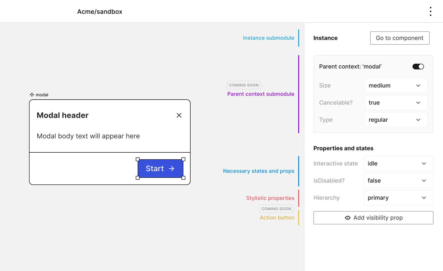
The module’s anatomy comprises three main parts:
-
Parent Context Submodule
- Allows styling in a specific component context. E.g, a button within a card while the card is hovered
- Can be toggled on/off
-
Functional States and Props:
- Examples: interactive state, disabled selector, checked/unchecked
-
Style Properties
- Create variants of a component
- Examples: size or hierarchy for buttons
- Add/edit properties
- Add dynamic slots
- Add visibility properties

The selector module is crucial as it sets the context for all other DDP changes in the modules below it.
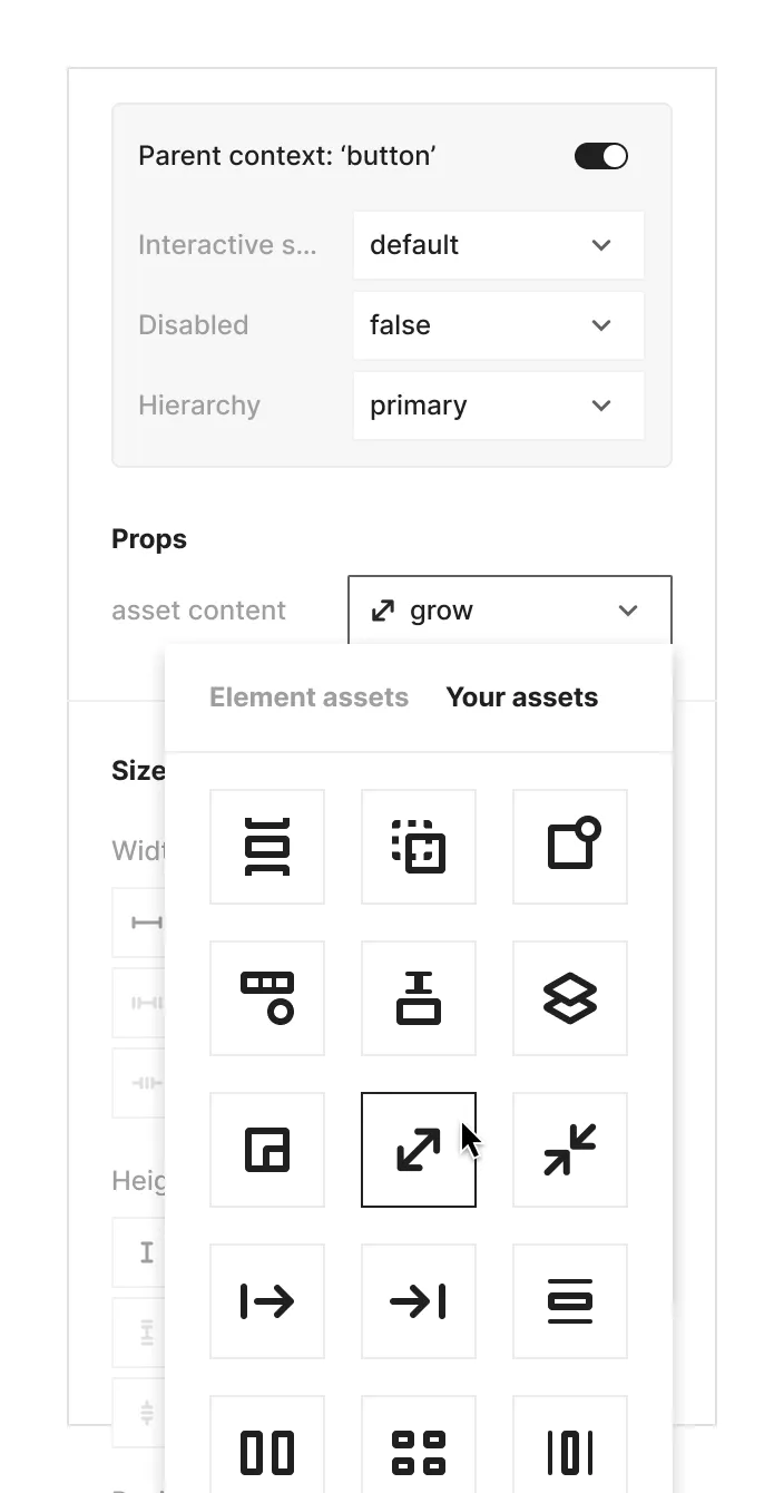
Asset Slot (Swap Assets Ability)
Assets in your designs allow for separation between the SVG content and the DDP values:
- Placeholder assets (e.g., icons in buttons) can have specific stylistic properties (size, color, opacity, etc.)
- Instances of components can swap the SVG content while maintaining the original DDP values
- New assets inherit all DDP values from the original asset they replace
This feature enables consistent styling across different asset variations within your design system.
