Text Field

Technical definition
The text field is a composite component build with a transparent ‘input element’ within. There’s no native text field element in HTML, but it is a very popular component in most design systems.
Anatomy and styling
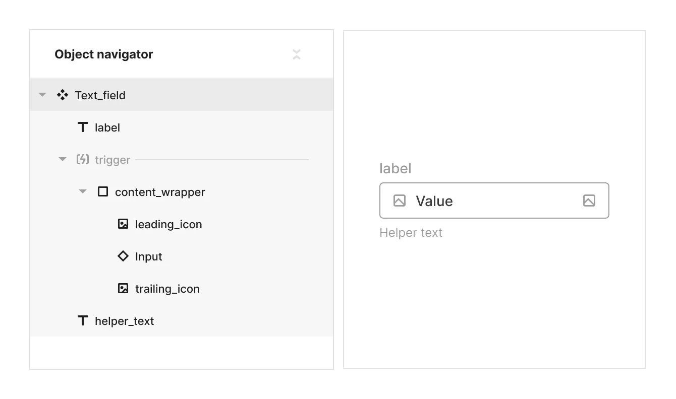
The Text field element consists of 3 parts: A label, a logical slot named ‘trigger’ that holds a div wrapper with the instance of the text area element, and a helper text.
Like with the input inside the Text area field element, the Input element inside the content wrapper is un-styled in all of its states. All of the styles are happening on the level of the content wrapper. This structure allows inserting other elements like icons into the content wrapper that are not part of Text area element, while still visually making it look like part of the ‘field boundary’.

Props and states
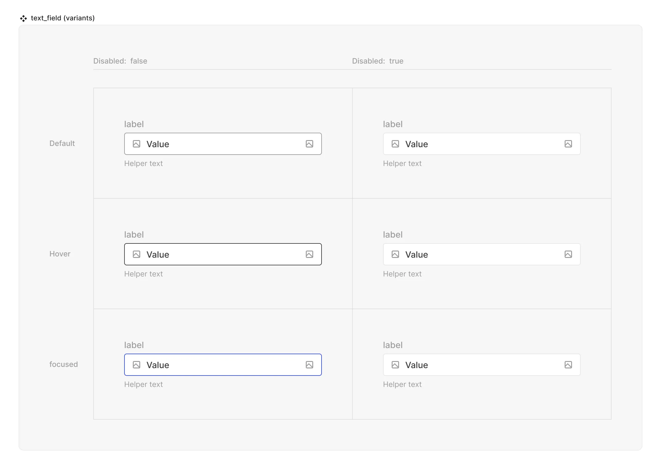
- Interactive state:
- Default
- Hover
- Active
- Disabled property
- true
- false
- Input text (text string)
- Placeholder text (text string)
Matrix

Special mechanics
- The Text field mirrors the placeholder and value props from the Text area instance that resides inside of it.
- Trigger (hit area) - is a container that can control what makes the input be focused for inputing text. By default the objects inside are the input element instance and 2 icons, one on each side. Adding or removing more objects is possible.
Live mode
In live mode you can:
- Switch between the interactive states of the Text field
- See the placeholder that was set in the source / instance of the input
- Type any value inside the input and see the placeholder text disappear.