Button

Technical Definition
The <button> HTML element is an interactive element activated by a user with a mouse, keyboard, finger, voice command, or other assistive technology. Once activated, it then performs an action, such as submitting a form or opening a dialog.
Anatony and Styling
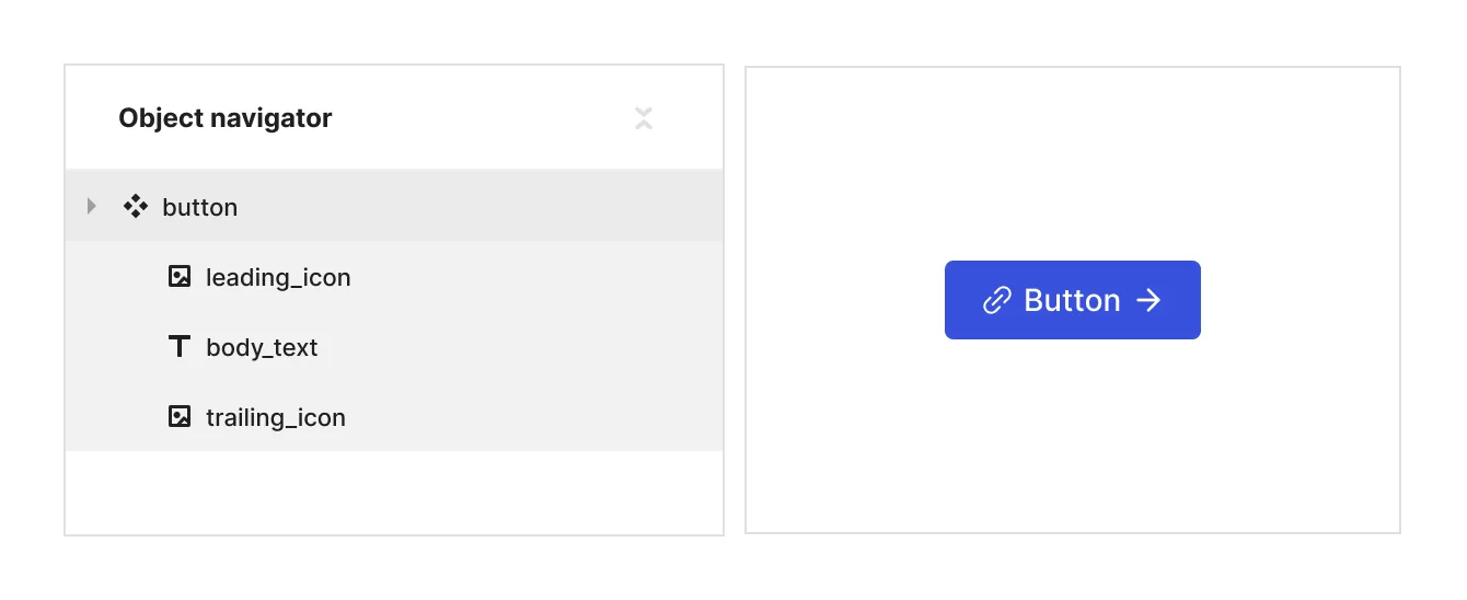
The button element comes pre-loaded with a leading icon, text label and a trailing icon.
You can influence the styling of the children of the button in relation to the button’s state and properties by selecting them in the parent context module.
To hide some of the children in some of the states - use display: none
To change the SVG assets use the ‘asset content’ property

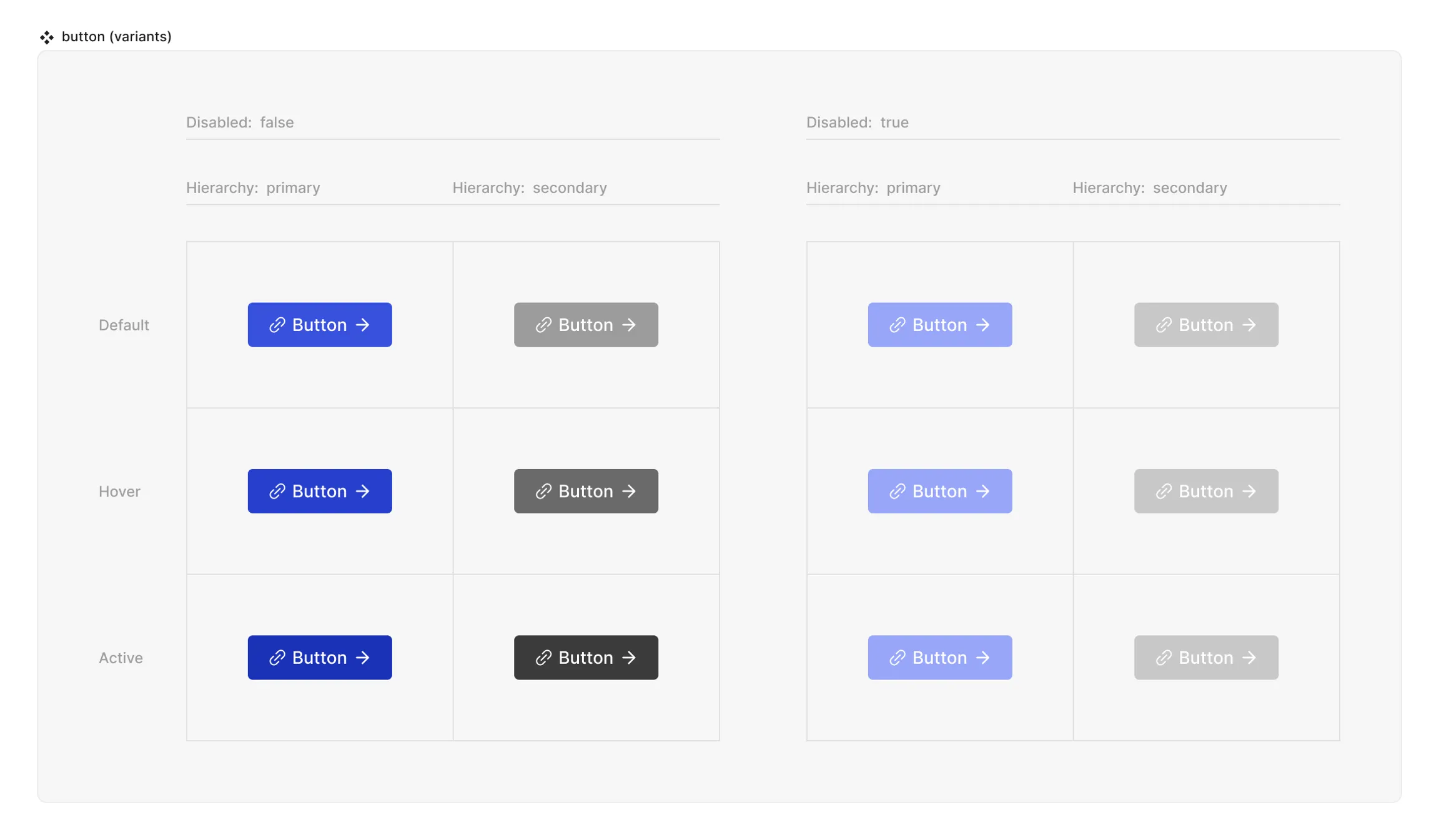
Props and States
- Interactive state:
- Default
- Hover
- Active
- Disabled property
- true
- false
- Hierarchy property (optional):
- primary
- secondary
Matrix

Special mechanics
The button does not have any special mechanics apart from the fact that everything inside of the button will trigger the action that the button will be connected to in the code.
Live mode
In live mode you can check the interactive states of the button.